

This is a breakdown of how I arrived at my insights on my first data project from start to finish with Microsoft Excel. To read details on the insights I got from my analysis, you can check out the report HERE.
The Problem
Roland is the CEO of an e-commerce company that sells holidays to users. He noticed that he hasn't been making many sales as before, and he wants to find out which particular landing page to improve so that his sales will improve.
Take note that the analyzed website is a fictitious one.
Out of 2442 rows, I was expected to pick the one landing page that needed urgent improvement. Want to find out how I was able to achieve this? Follow me.
Business Understanding
Even though I had a basic understanding of web performance metrics because I work as a social media manager in a web design company, I still went on to do extensive research to figure out the vital web performance metrics that will help me gain insights into the landing page to be improved.
The metrics I identified include session duration, website visits, bounce rate, percentage of new and returning users, and conversion rate.
Only two out of these metrics were in this dataset. Fortunately, the other three metrics could be derived from the other variables in this dataset.
Cleaning the Data
As usual, duplicates were removed.
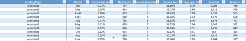
Cleaning the dataset further was a bit complicated. Each unique landing page address had metrics from January to October, all in 2017. Below is an illustration.
Even though this seemed good because it would reduce the errors in my analysis, there was a little problem. Some landing page addresses didn't have values from January to October.
I knew that a better way of getting insights from this data would be to evaluate their averages, so I needed these averages to be made of these ten months (January to October).
For landing page addresses that had values in five months or less, I deleted them because using them in the analysis would be biased.
Then for the others that didn't have values of all ten months but greater than five months, I calculated their averages and used the estimated value to fill into the missing months.
There were also some missing values. I used the averages of surrounding and related cells to fill in the missing values.
Sometimes, a particular month would appear twice with different values, and then one month would be missing. This means that one of the values belongs to the missing month, but how will I know the month this value belongs to?
I would study patterns in the range of values. Let's say that October appeared twice, and July is missing. When I study the patterns, I will notice that the last three months before October have values lower than the other months before July.
For the October value within the months closer to July, I will assign them to July and then leave the other value assigned to October.
I studied the dataset closely to see that everything was in order before I went on to derive the important metrics in my analysis.
Before I show you the formulas I used to derive these metrics, let me take you quickly through the definitions of these metrics for better understanding.
Session Duration: This is the timeframe during which a website user makes active interactions on the website. This activeness means clicking or scrolling through.
Website visits: Otherwise called sessions, it is the number of users that visit a website.
Bounce rate: This is the percentage of website visitors that leave the website after viewing only one page.
Percentage of new users: This is the percentage of users visiting the website for the first time.
Percentage of returning users: This is the percentage of users visiting the website more than once.
Conversion rate: This is the percentage of website users that carry out the desired action on a website. On the analyzed website, this action is the purchase of holidays.
Deriving Other Metrics in the Dataset
Below are the headings of the dataset. The "sessions" is another name for the website visits.

To derive the bounce rate, percentage of new users, and conversion rates, here are the formulas that I used:
Bounce rate = (Bounces/Sessions)*100
Percentage new users = (New users/Sessions)*100
Conversion rates = (Transactions/Sessions)*100
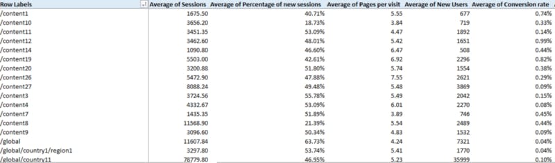
After calculating these metrics, I got the average for each landing page using pivot tables. Remember, these metrics ran from January to October, so I needed to get the average of all ten months. Here's a glance at my results:
Invalidating my Assumptions
To get good insights from my dataset, I had some assumptions in mind:
- The conversion rate decreases as the bounce rate and percentage of new users increase.
- The conversion rate increases as the session duration and sessions increase.
- My data distribution has to be normal.
Starting with my third assumption, I always thought I had to make my data distribution normal before analysis, but I was wrong. Talking to various people and with the bit of experience I have with generating website traffic, outliers in my dataset were not necessarily bad.
This was because, on different days, website traffic could be way higher than usual, while on other days, it could be very low, so deleting outliers might make my analysis biased.
The only way to validate my first and second assumptions was to use the correlation technique. So using the data Analysis tab in Excel, I calculated the correlation coefficient of the mentioned variables, and here's a screenshot of what I got:
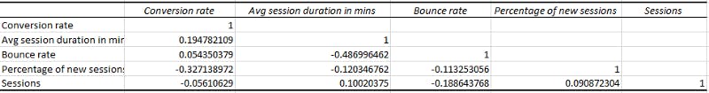
Notice that the rows that had 1 in them had variables correlated to themselves, but others that had decimals were not even close to 1 or -1. This invalidated my assumptions and proved that these variables were not correlated.
Even though theoretically, these variables could be related, I didn't want to fall into that temptation of applying general principles when my dataset was speaking another language.
So there you have it, none of my assumptions proved true, so I went straight to analysis.
Analysis
I won't talk about the insights I got while analyzing. To read about it, click HERE. I'll list my steps to arrive at my insights and recommendations.
I researched the industry standards of the performance metrics of e-commerce websites.
I compared the overall performance metrics of this website to the industry standards.
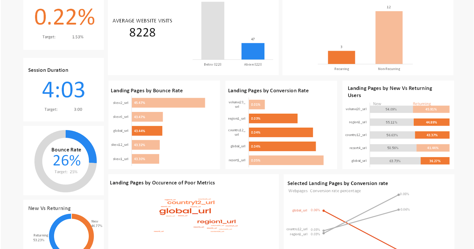
Then, I evaluated the average website visits and divided my dataset into two: the landing pages below the average website visits and those above the average website visits. The former was 184, while the latter was 47.
I chose to analyze the webpages above the average website visits because I would want to save my imaginary client's money and time by focusing on the bad-performing webpages with higher traffic.
From the 47 bad-performing web pages, I picked the top 5 with the lowest conversion rate, highest bounce rates, highest percentage of new users, and highest session duration. I chose to use the highest session duration because when session durations are higher than average, it could mean that the website is challenging to navigate.
Evaluating the top 5 that had these bad performances, I noticed three web pages repeatedly appeared in three of these four metrics.
I picked these three web pages and evaluated the trend of their conversion rates.
One of these web pages had its conversion rate drastically to zero, unlike the others.
Do you want to know that one landing page did exceptionally badly? Then check out my data report HERE.
Lastly, to convince my client that he needs to act fast on this landing page, I forecasted the November and December conversion rate using the Excel forecast formula. All my visuals are in my data report.
I'm glad you've come this far to understand my thought process in this first-ever analysis. I don't take it for granted. Thank you!